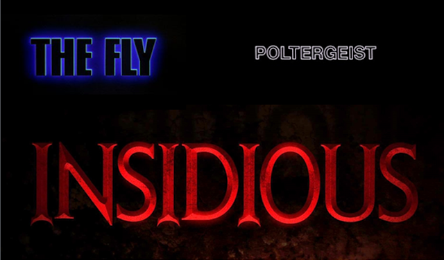
I researched into film titles, the colours, the boldness and the usual conventions of a horror title.
The usual conventions of a horror title consists of dark colours, connoting blood, danger and death; which is the main aim in a horror film. The titles are also bold and noticeable, this ensures that the audience can easily understand the film name as well as remember it for further research or telling a friend/family member.
I practised and searched through Microsoft Word fonts and copied the fonts that would suit my horror film. When am designing the font, I will then add in colour and (or) special special effects.


Comments
Post a Comment